Why is the Apple bitten?
By Aniket Gupta | 01 Nov 2023
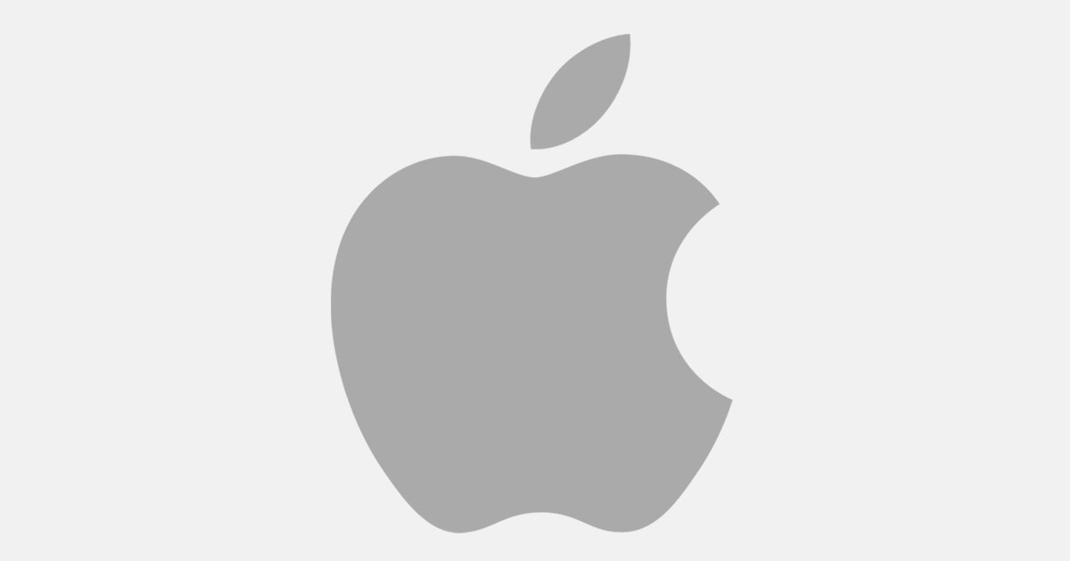
In the world of tech giants, Apple reigns supreme. We’ve all seen that famous apple with a bite taken out of it gracing laptops, phones, and tablets everywhere.
But why the nibble?
Is it a homage to the computer term, ‘byte’? Or is it a nod to Isaac Newton’s fateful relationship with gravity? Perhaps a biblical wink to Eve and her forbidden fruit? Well, these reasons might be fascinating, but the real truth is rather dull.
The genius behind the bite-sized branding is Rob Janoff, the creator of the Apple logo. In a 2020 interview with Creative Bits, he dropped the juicy revelation. “I designed it with a bite for scale, so people get that it was an apple, not a cherry or a tomato.” So, there you have it, folks — no Newton, no Eve, and no byte. Just a simple solution for keeping the fruit recognizable.
Now, while the logo’s backstory might be less thrilling than those other theories, its evolution is a wild rollercoaster of design twists and turns. Let’s hop on the time machine and take a trip down logo memory lane.
1976: The Apple’s Big Bang moment
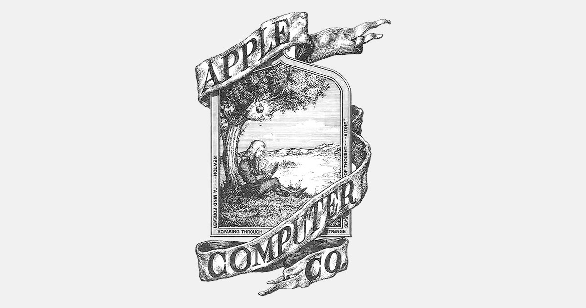
No, that’s not Steve Jobs casually sitting under a tree, waiting for enlightenment to strike. It’s a tribute to the genius, Isaac Newton, and his encounter with that famous apple. This first logo looks more like it belongs on the front of an antique bookshop or a quirky pub than on the technology titan we know today. Ronald Wayne, a slot machine entrepreneur, designed this logo. Unfortunately for him, his logo didn’t last very long.
1977: The birth of the rainbow Apple

In 1977, Apple founders Steve Jobs and Steve Wozniak knew it was time for a change. They needed something sleeker to put on a tech device. Enter graphic designer Rob Janoff, who whipped up the logo for the debut of the Apple II personal computer in April 1977. Janoff’s design was a stroke of genius in its simplicity — a 2D apple with a single bite. But the magic happened when it was bathed in a rainbow of colours, making it stand out among other brands.
1984: A little logo tweaking
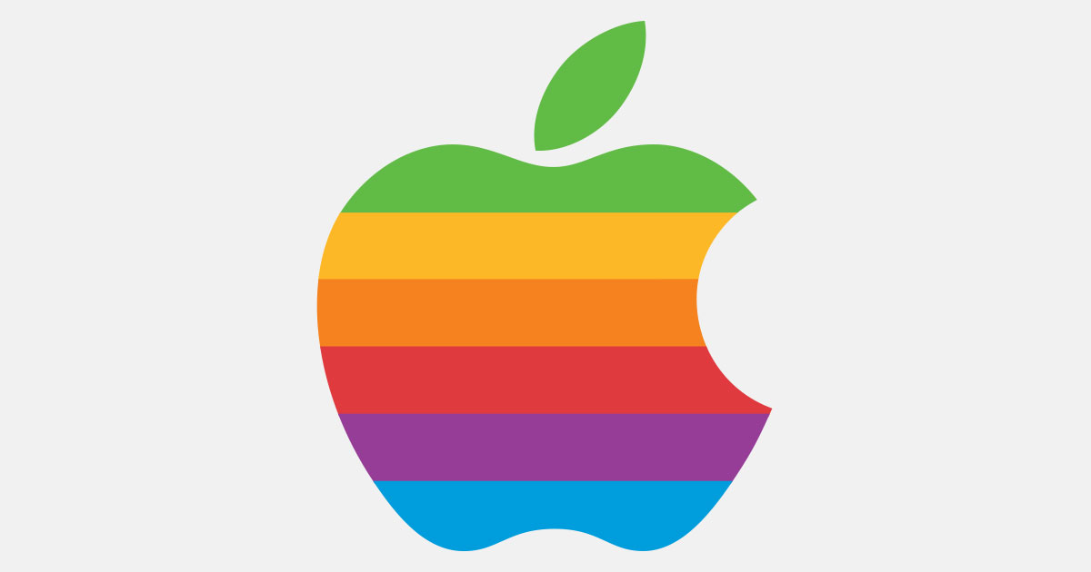
Fast forward to 1984, when Landor & Associates was brought in to prep for the launch of the Macintosh, which got to be known as Mac. The logo got a fresh typeface, and it was often used without the company name. The colors and shape got some changes too.
1998: A luxury makeover
In 1997, Steve Jobs returned to Apple and decided to rebrand it as a luxury company. Out went the rainbow, replaced with a sleek, black apple, and the shape was refined, making it slightly thinner.
The modern Apple logo
Today, the Apple logo remains simple yet iconic. It’s seen in black, white, and grey (or silver), depending on the application. The grey logo, especially on the Apple website and store as its favicon, adds a premium touch, echoing the metallic look on devices.
So why is the Apple logo such a triumph? It is simple yet unforgettable, conveying the company’s name in a literal, abstract, and sleek manner, perfectly encapsulating Apple’s focus on minimalist, high-quality design.
It’s a story of evolution with a bite-sized twist!
