The epic tale of Nike’s iconic logo
By Aniket Gupta | 01 Nov 2023

Once upon a time in 1964, in the land of athletic dreams, two visionary souls, Phil Knight and Bill Bowerman, came together to create a brand that would redefine sports and fashion forever. They named it Blue Ribbon Sports (not the catchiest name, we agree), but eventually transformed it into the iconic powerhouse we now know as Nike in 1971.
Fast forward to today, and Nike is not just a brand; it’s an absolute global icon of athleticism, determination, and innovation. With over 44,000 employees spread across the globe and a staggering $15 billion in total assets, it’s safe to say that Nike has been sprinting ahead in the race to athletic dominance.
But what sets Nike apart from the competition?
Well, beyond their iconic shoe styles and their global dominance through superstar athlete sponsorships, there’s one standout element: their brand logo.
But hold on to your hat (or your sneakers); it’s not just any logo—it’s the legendary "Swoosh" that’s been turning heads since it burst onto the scene back in 1971.

This iconic emblem is the brainchild of a graphic design student from Portland State University, Carolyn Davidson. And here’s the kicker: She received a mere $35 for her groundbreaking design. Talk about a masterpiece that was seriously undervalued!
Later in 1983, it was revealed by Nike co-founder Phil Knight that Carolyn was also gifted some Nike stocks and a gold ring in the shape of a swoosh with a diamond in it.
Inspiration struck Carolyn when she thought of the Greek goddess Nike, known for her speed and strength. The wings of the goddess planted the seed of the Swoosh design, and the rest, as they say, is history.
The Nike ‘Swoosh’ has become one of the most recognizable logos in history. In fact, it’s so famous that most of Nike’s recent ads use the logo without even mentioning the company’s name, trusting that the world knows exactly who they are.
Alongside the Swoosh, their legendary tagline ‘Just Do It’ has become the perfect mantra for athletes and couch potatoes alike, thanks to a little inspiration from death row killer Gary Gilmore’s last words, ‘Let’s do it’.
“Well, I didn’t like ‘Let’s do it’ so I just changed it to ‘Just do it’,” said Nike’s advertising executive Dan Wieden in 2015.

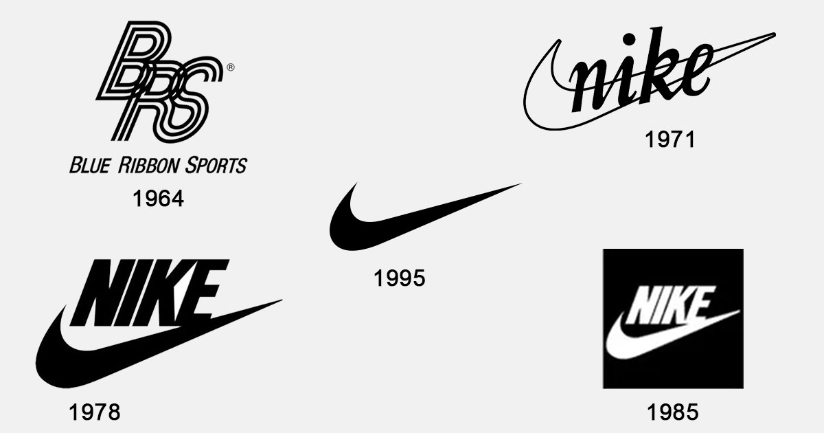
Now, let’s take a journey through time and witness the evolution of this iconic emblem:
- 1964: Phil Knight and Bill Bowerman start a shoe brand and name it Blue Ribbon Sports, but later change the name to Nike and look for a graphic designer to create a brand logo.
- 1971: Carolyn Davidson’s initial designs may not have caught Phil Knight’s eye, but they eventually win him over.
- 1978: The cursive serif typeface is replaced with Futura Bold, giving the Swoosh a more geometric shape. The ‘E’ even got cozy with the swoosh’s tail. Talk about typography innovation!
- 1985: For a brief period, the Swoosh finds itself locked inside a square. But that doesn’t last long, as Nike begins endorsing superstar athletes, with Michael Jordan leading the charge.
- 1995: Finally, Nike settles on its current logo, the lone Swoosh. Today, it represents athleticism, speed, and quality in clothing design, making a solid case for the power of simplicity.
So, next time you slip into your favorite Nike gear, or lace up those iconic athletic shoes, remember that you’re not just sporting a brand; you’re carrying a legacy, a symbol of speed, strength, and sheer determination.


